Since many of you use e-lesson plans on a daily basis, we have decided to make them more functional and their look more appealing. Based on the feedback we have received from the ESL Brains community in the last two years, we have redesigned e-lesson plans to make them clearer and more user-friendly. The brand new e-lesson plans have been tried out by about 30 beta testers. We really appreciate your input!
Without further ado, let us introduce the new e-lesson plan design! ???
Layout
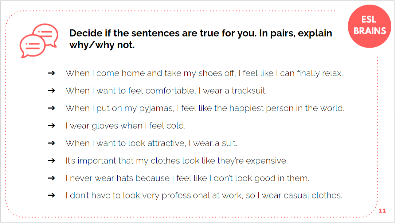
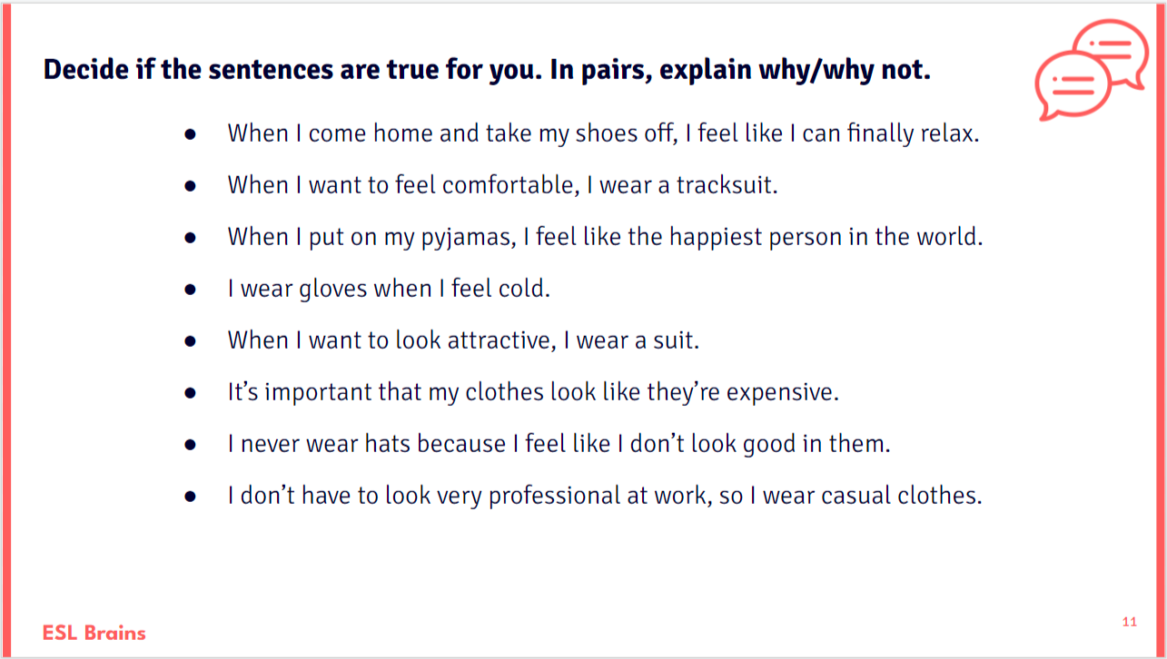
The texts on slides are centered to make the layout cleaner and unambiguous. The font visibility is enhanced, which makes it easier for students to scan or read texts more quickly. As one of the teachers who used the new layout pointed out, the white space on the left can be used to add some on-screen annotations during the lesson.
Boxes
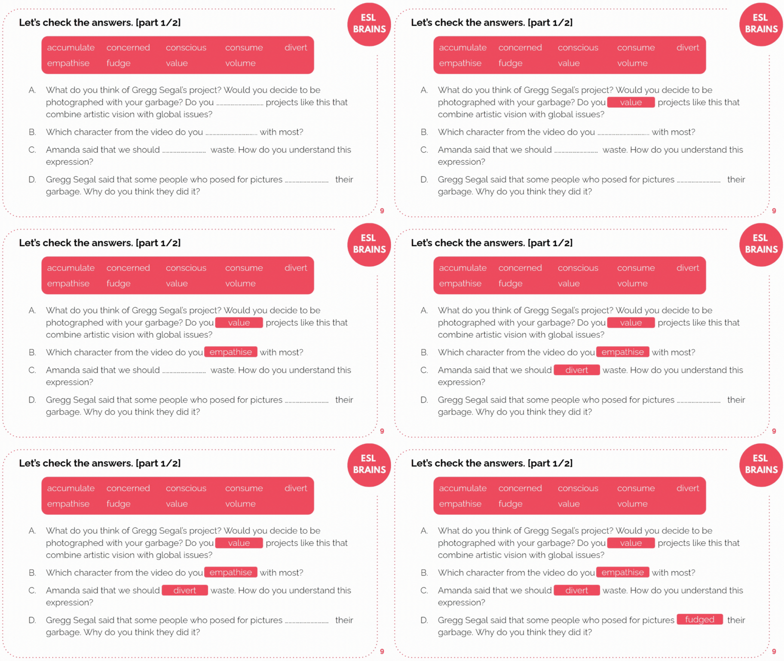
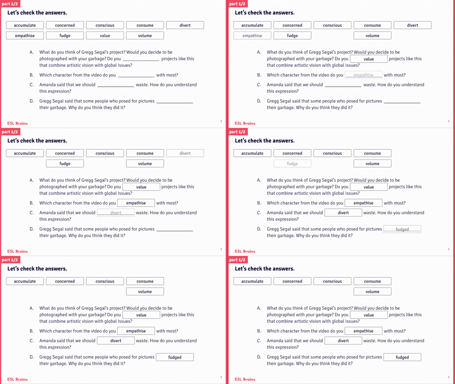
Wherever there was a box with words or phrases to choose from, there are now several boxes. The box used in a gap disappears from the set so that students can see which options are still left unused. This arrangement clears up any confusion while the task is being checked and makes the process quicker.
Highlights
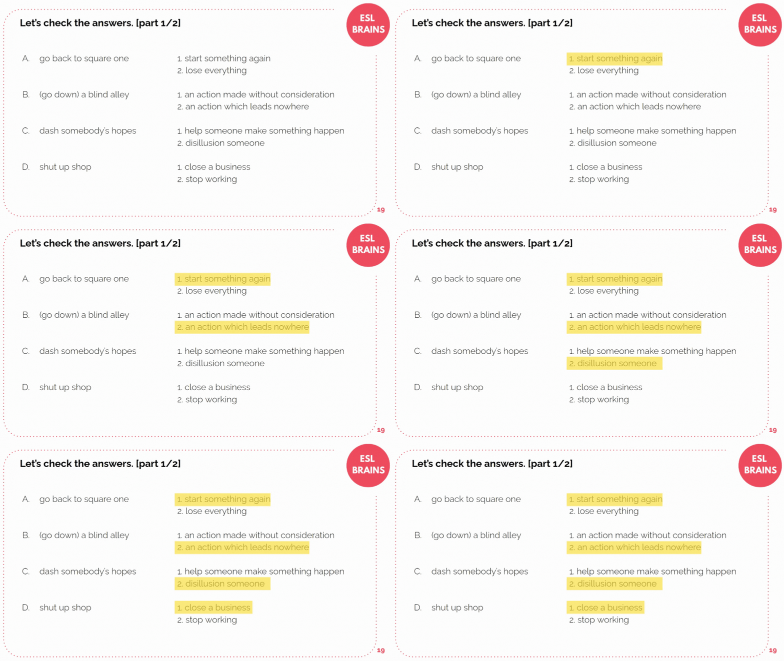
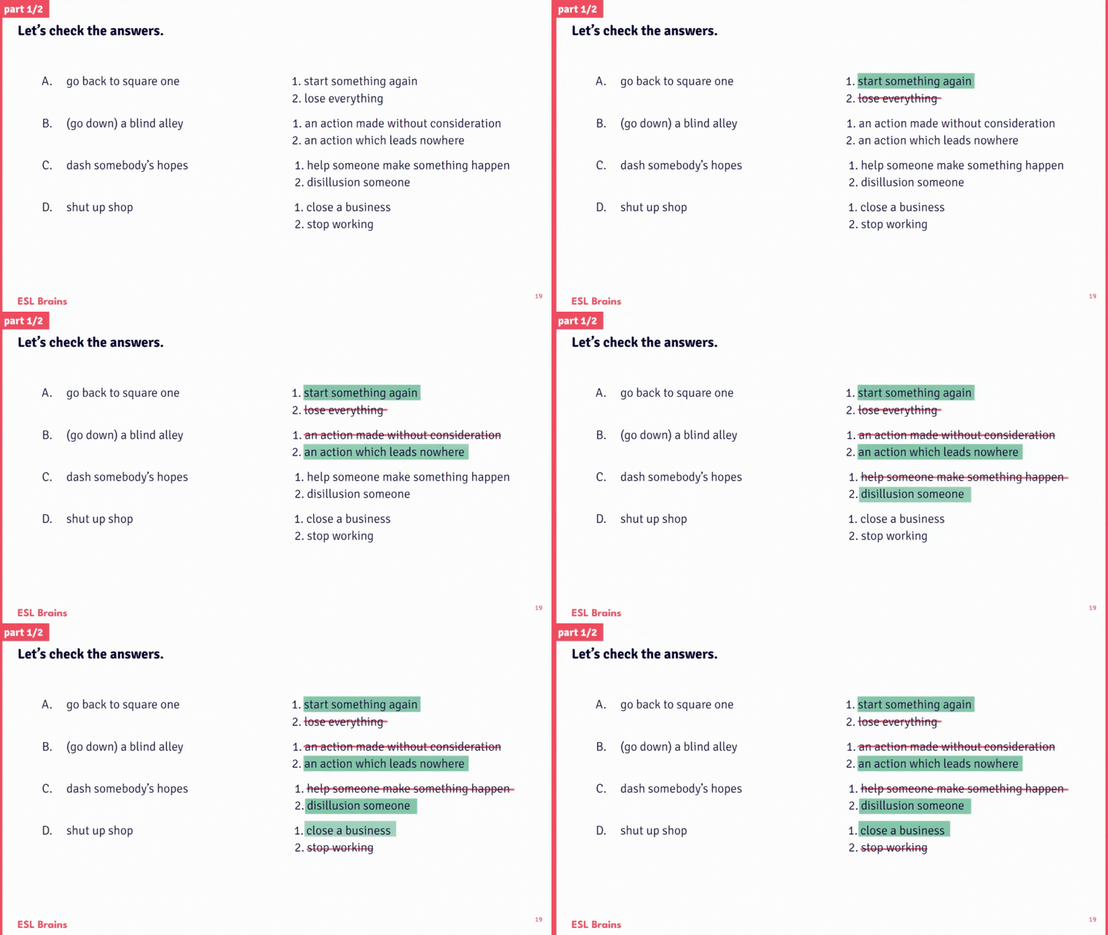
The correct answers are now highlighted with a more prominent colour. Thanks to the new font, the highlighted text is still very easy to read, which eliminates any doubts about the answers. The change has been introduced as some teachers thought the yellow highlight was not clear enough. Notice that if a word or a phrase needs to be chosen in a sentence, the correct answers are highlighted, but the incorrect ones are also crossed out. This helps the process of checking to run more smoothly.
Video comprehension questions
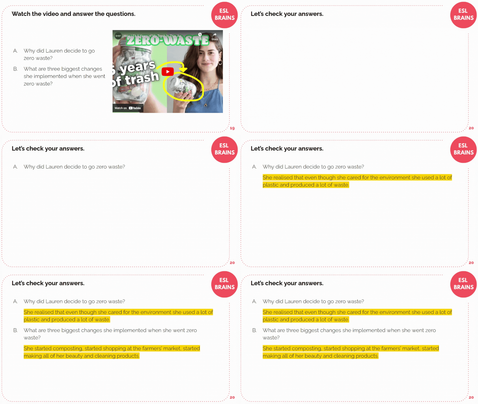
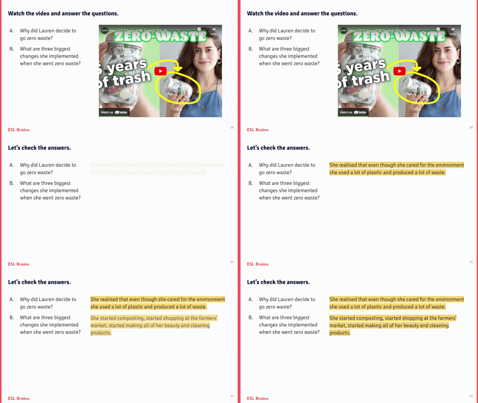
The answers to video questions are shown next to the questions rather than under them. It makes the transition between the slide with the video and the one with the answers more user-friendly (as the position of the questions doesn’t change), and it helps students quickly find the answers.
Column matching
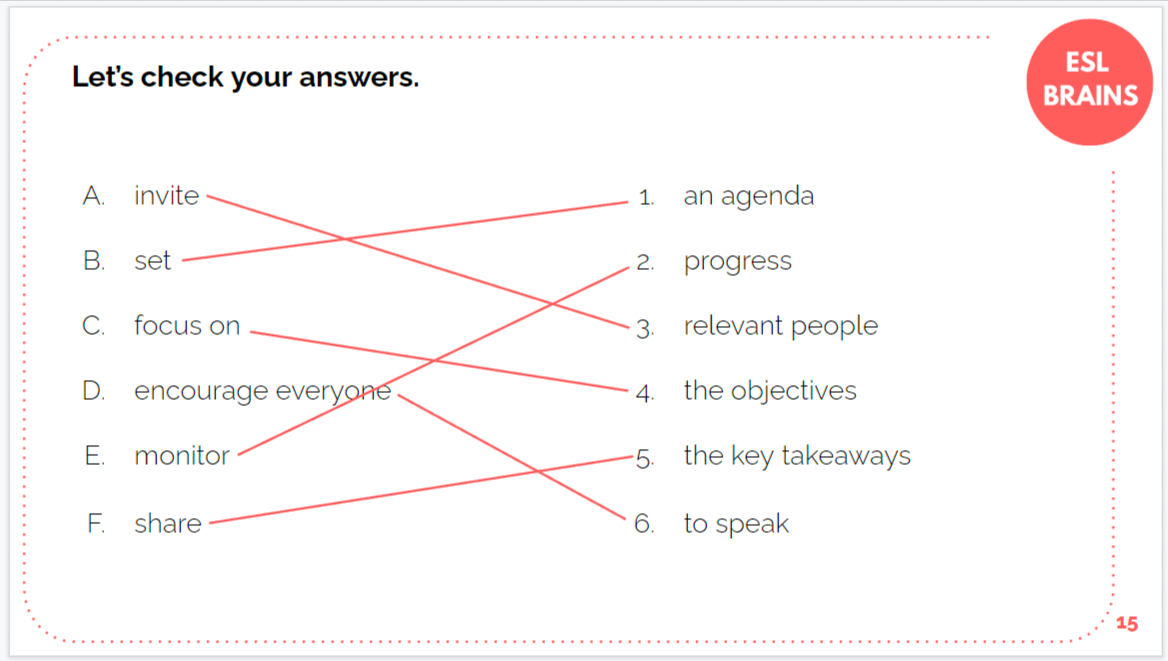
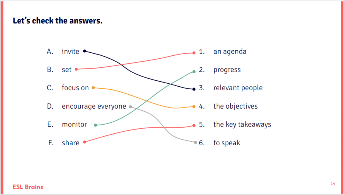
Matching tasks are now more colourful! It has been pointed out to us that the lines blend together in some slides, so we’ve decided to fix that by adding all ESL Brains brand colours to the mix. The dots on the line ends help students see the answers better, too.
Want to test the new layout yourself?
Go to Save the ocean, save yourself to see the first brand new e-lesson plan! Apart from that one, we’ve replaced about 15 e-lesson plans today so you can check out, for example:
- Lying in your garbage
- I’m afraid that’s outside the scope of this meeting
- When I want to feel comfortable, I wear…
All newly published ESL Brains e-lesson plans have the brand new look from now on. We will be also gradually upgrading the older e-lessons to the new standard. It might take some time, so don’t be alarmed if you keep seeing old e-lesson plans with the old design. They will all have the awesome new look at one point!



Fantastic, well done guys!!
Amazing !
Splendid! Absolutely amazing.
I love your work and I love the way you are always improving and furthering the practicalities in your lessons.
All the best.
filipe
This is really awesome! Which one of the recent lesson plans uses this new layout?
Apart from the ones linked at the end of the post, go here (top 5 lessons) or here (bottom 5 lessons) to find the other 11 lessons in that format. More coming on a weekly basis and of course all the new lessons will follow the new style.
Wow, such simple but meaningful and effective changes! Well done to all who were involved 🙂
The body text is easier to read and the boxes are also more user friendly. Great job, keep up the good work 🙂
Awesome! Glad you appreciate the improvements.
Thank you!
WOOOOOW! great job guys! Not that I saw any issues with the previous format.
There’s always something to be improved!
Nice!
Amazing job!
Great work guys!
Looks awesome 🙂 more like a textbook
I never know if this is a compliment or not 😉 just kidding.. thanks for your comment 🙂
Great! Thanks for making our life easier !
Love your material, guys!
That’s wonderful news! The layout looks soo effective! ✨✨
This is awesome!
I’m sure these changes will enrich your amazing classes even more!
Thank you
Great news!!
I just love using ESLBRAINS lesson plans! They’re perfect!!! And now the e-lessons are even better!!!
You’re the best ones!
Love it! Fantastic! Thanks you guys!
Peeeeeeeerfect! You guys are amazing
great! thank you!
Awesome!
Wonderful improvement, many thanks!!
Great!! The layout looks amazing! Will they still be hosted on Google Slides? Thanks!
Yes, we keep on using Google Slides. That’s going to stay!
Love the changes! Hats off to the UX team. Thank you ESLB for making my job easier!
Bravo!
So excited about this! Thank you! Much love to the people behind this site!!!
Great!
Thanks again, have tried the new layout, my students love it! It would be great if you could say which 15 e-lesson plans have been replaced 🙂
I replied with 2 links to a similar comment above explaining the easiest way to find them but if you need a list, here it is:
When I want to feel comfortable, I wear…
The right to rest and other employment laws
Lying in your garbage
Why is quitting a job while working remotely so distressing?
Who am I? – guessing game
It will never catch on! (will for predictions)
How much control should the state have over children’s upbringing?
I’m afraid that’s outside the scope of this meeting
When in Rome…
Who should tackle misinformation on social media?
Behind every success there are dozens of failures
The circular economy
Top plastic waste-generating country is not in Asia
If he hadn’t pressed the button, nothing would have happened
—
we might inform you what got converted in our weekly update newsletter, so make sure you’re subscribed.
thanks a lot, I appreciate it! You guys are the best
Well done! Thank you so much for the continuous improvement. It is a huge timesaver in my busy teachers life!!
Looks amazing!! Thanks!
Wow! That’s a great job! Thanks 🙂
I love the new design!
Great, thanks a lot for the improvements!!!
I really appreciate this change! Thanks!