
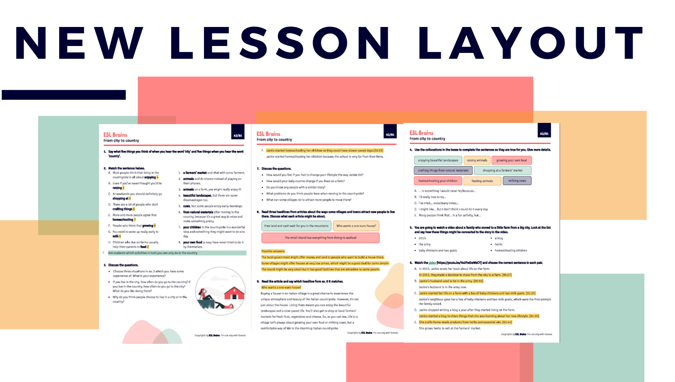
User-friendly, clear and professional – these are the qualities you will see in the new ESL Brains PDF design. We’ve been working on it for several months and are truly excited to show you what the lessons published from September 2023 onwards will look like! You can see the first lesson in the new layout here.
The design is a result of the feedback you have been providing us with. What you might quickly notice is the new font and numbering, which resembles the e-lesson plan design. This change was made with the knowledge that some of you use both e-lessons and PDFs with the same students.
However, the improvements go far beyond this. Explore the exciting updates below!
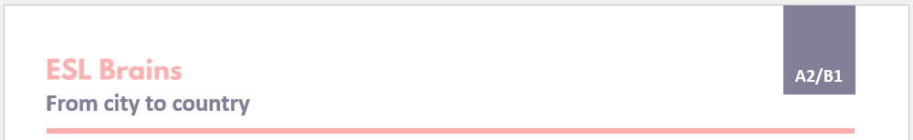
Headers
The Teacher’s PDF contains the information about the lesson level, as well as the ESL Brains logo and the lesson title as before. In contrast, the student’s version has no level information. We know some of you use the lessons with different levels, and we don’t want you to get questions from confused students.
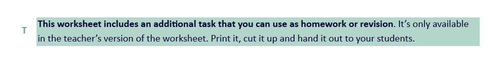
Teacher’s notes
These are now much more visible as they have a green background and the letter ‘T’ next to them. Even if you print the PDF in black and white, there will be no doubt which part is a note for you and not a part of the lesson.

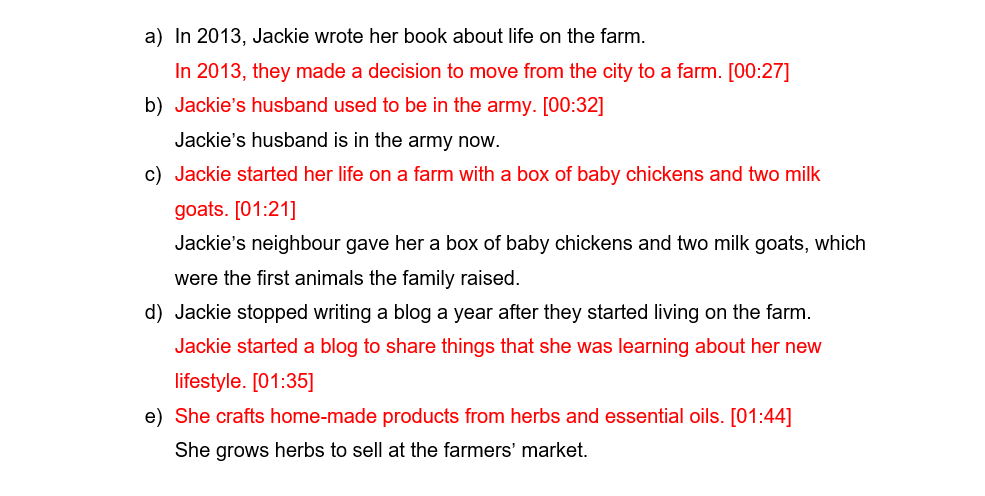
Answers
The answers in the teacher’s PDF are now highlighted in yellow. Similar to the teacher’s notes, this makes answers more prominent, and printing the lesson in black and white does not pose any issues.
Boxes
When students need to discuss ideas, we now use neat and colourful boxes. This improved design is more engaging and pleasing to students, hopefully making them excited about the task.
Texts
Texts have wider right margins than before. This extra space allows students to take notes or jot down new vocabulary, and it also helps the reader focus as the text column is narrow.
Word boxes and gaps
In the Student’s PDFs, gaps are now represented by solid lines instead of dotted lines. Additionally, when gaps need to be filled in with specific words, each word is presented in a separate box. These changes align the PDFs more closely with the e-lesson plans and enhance the overall tidiness of the documents.
These are just the most significant changes in the new PDF layout, and you will notice more tweaks here and there. But we do hope you like all the improvements! Use the new PDFs with your students and ask them what they think!

I love the new design. I think it’s great that it takes learners and teachers readability into account. A more colourful approach makes a lesson lighter and easier to follow.
🙂
Perfect design! Absolutely love it!!! Thank you, ESL Brains!
Thanks, we love it too 🙂
Thank you. I love it!
Awesome!
this is great absolutely love it
Thank you for sharing!
GREATT
🙂
Wow! This looks amazing! Thank you so much!
Lovely to hear that!
This looks great! Thank you 🙂
Awesome! Thanks for sharing 🙂
It’s wonderful! Thank you 🙂
We’re glad you like it!
This is great! 🙂
🙂